Mark Anthony Burgoyne (He / Him)

My current focus is to establish the relationship between my graphic design and photographic practise(s), sometimes distinct, often not – to develop an understanding of the thresholds and commonalities thereof. My work is developed through practice-led research driven by an intricate concept based methodology. I am interested in the exploration of memory, and through observation of both natural and built environments, the interrogation of meaning. Practically, my final year work is focussed on typography, in particular the development of a custom typeface, and an expansive photographic project exploring ‘place’. My practise embraces the tactility of analogue processes, synthesised with the immediacy of digital – forming a workflow that allows my varied outputs to form a cohesive body of work.
Contact
Typeface – Jean
I set myself the brief to create a variable typeface, formed from two distinct typefaces based on and for my Scottish Gran and Dutch Oma, both of whom have passed away. The typefaces were to incorporate characteristics of each as well as historical elements, in that Plantation, Glasgow, where my Gran was born was erased years ago through destruction of the tenements and thus the entire area, and Valkenswaard, where my Oma was from being subject to heavy bombardment during the war in Operation Market Garden.
‘Jean’, typeface created for my Gran – a very slight woman with a kind nature but who didn’t mince her words. She developed a curvature in her spine in her later years and died little more than 4 stone in weight after a long battle with cancer. I have set about creating a typeface that has aspects of her character but also a verticality that sees her at her true height, 5’2, as she liked to remind us. Contextualised as scrabble tiles, referencing my own memory of being defeated by her as a child, but also, in the transparency of the tiles, the notion of the gradual decay in our memories of lost loved ones and the subtlety with which they are kept alive in our minds.


Monuments
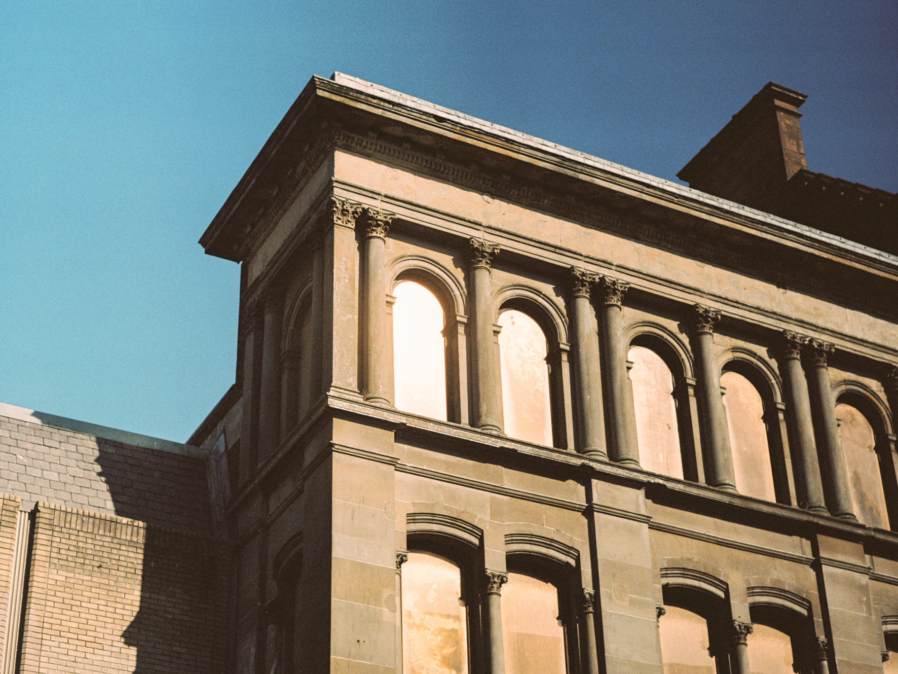
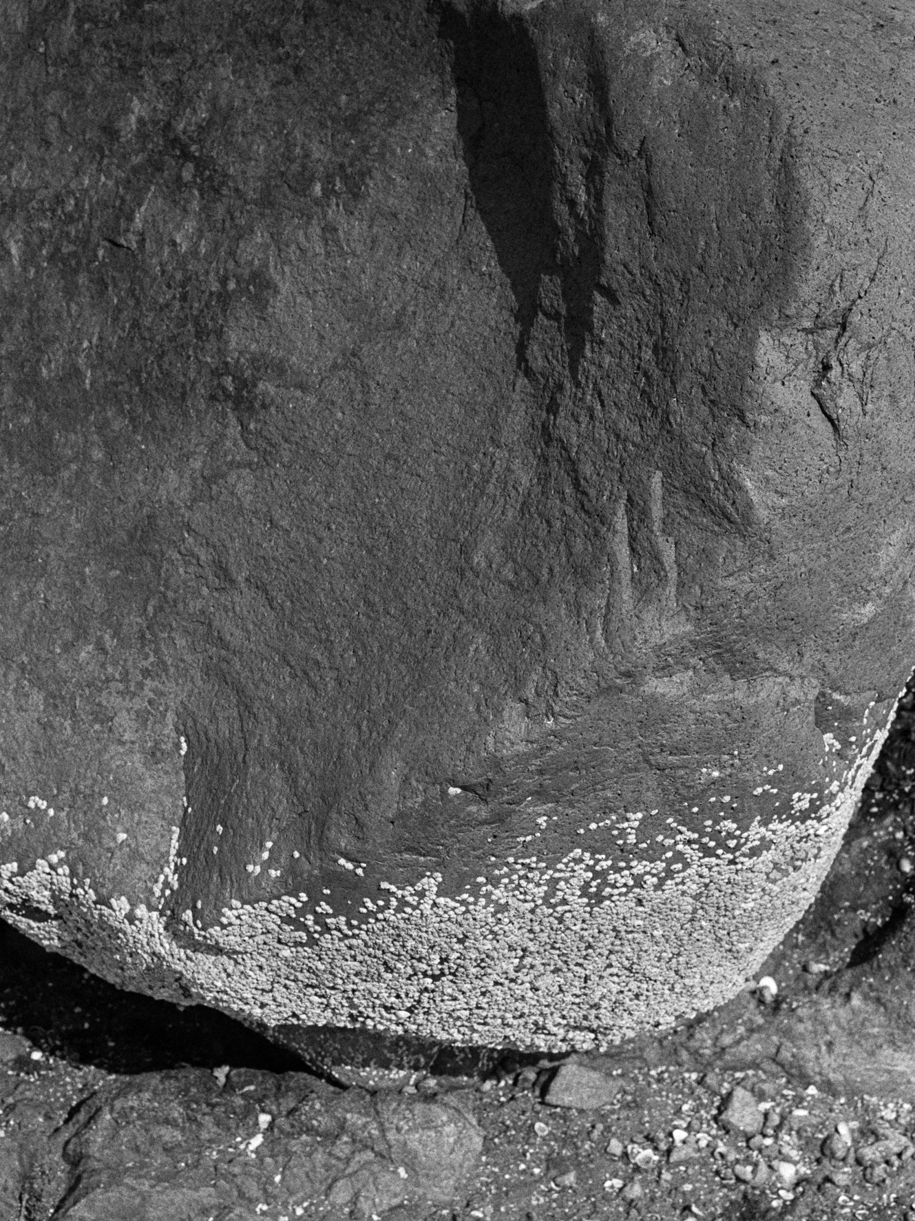
Still in its research phase, this presentation of images represents a small sample of the photographic responses to the project concept laid out in my critical journal, ‘Detail of the Dérive’, completed as part of my studies this year. This project is developed through an exploration of memory, those found and stored in natural and built environments, and through observation, the interrogation of meaning.
All photographs available for purchase. Please email for details and pricing.


Work in Progress Identity
Collaboration with Abigail Allen and Leonie Hiller. Inspired by the idea of getting back to the physical studio after a year at home – most relishing the opportunity the facilities provide, to produce work using analogue techniques and processes – represented through the mechanical process of the punch card. The initial idea is to represent the digital process driven work that was the majority of our projects last year and have it as a background to a bolder gesture, something that emerges into the physical world, beyond screen and into form.
Understanding the importance of not only working with physical processes but in interacting with others, in considering how our work is interpreted – the identity seeks to show what the studio environment offers, engagement, hustle and bustle, interaction, materiality, details slowly emerging into physical form from small thoughts, often sporadic but always part of something more – inspired by and inspiring others to see what happens when you make a thing and see how others engage with it and embracing the symbiotic nature of communication design and its emergence as part of an ongoing dialogue with our surroundings.


Detail of the Dérive
‘Detail of the Dérive’ is a critical journal that focuses on a particular project, hereafter developed over the course of my honours year at The Glasgow School of Art; picking up threads from a project I undertook as my first project at GSA, exploring place, history and stories written into the landscape, and which informed a new perspective on reading and deciphering the world, enabling new approaches to making work and a search for an authentic voice and visual language. I am a student specialising in Graphic Communication. Even though the project which forms the basis for this Critical Journal is in fact photography-led it is considered as any graphic design undertaking is, beginning with practice-led enquiry, the products of which suggest a distinct research path and methodology. Thereafter, projects continue, naturally, in that vein – encompassing and engaging with a broad-range of existing practice and theory, which in this instance represents a broad range of photographers, thinkers and graphic design practitioners from throughout the 20th century to contemporaries.


Type Poster
This was a project a friend and I devised in the Modern Institute while visiting the Jeremy Deller exhibition. Simply, to make posters using the caseroom at the GSA and to exhibition / sell them to generate some funds for our degree show. We later, as a group, settled on the idea of creating posters from books (later expanded to music and films) that were banned or censored in someway, or at least were the subject of efforts to ban or censor.
I discovered that attempts were made to ban Dante’s Inferno, and whilst there was merit in the objections to the book – it was deemed too important to Italian history and culture to take seriously the idea of an outright ban. However, I felt that perhaps a small gesture could be to obscure it by placing the text itself in hell, metaphorically speaking – represented by the gates of hell, the form of which I modelled on the architectural arches behind a statue of Dante in Piazza dei Signori, Verona. My type was set digitally and printed via a polymer plate – arches were cut in cardboard.


