Leonie Hiller (she / her)

Within my current practice as a designer, I value the materiality and tactility of outcomes and I like to consider using all the senses, which enables me to create playful, yet mature end products. For me, the concept is at the heart of my design process and influences the decision making in every step. I am interested in the themes of culture and society, which go further into the themes of nostalgia and heritage/ identity. These have influenced my past projects and I tried to incorporate them in the visual exploration of typography, moving image and design within the environment.
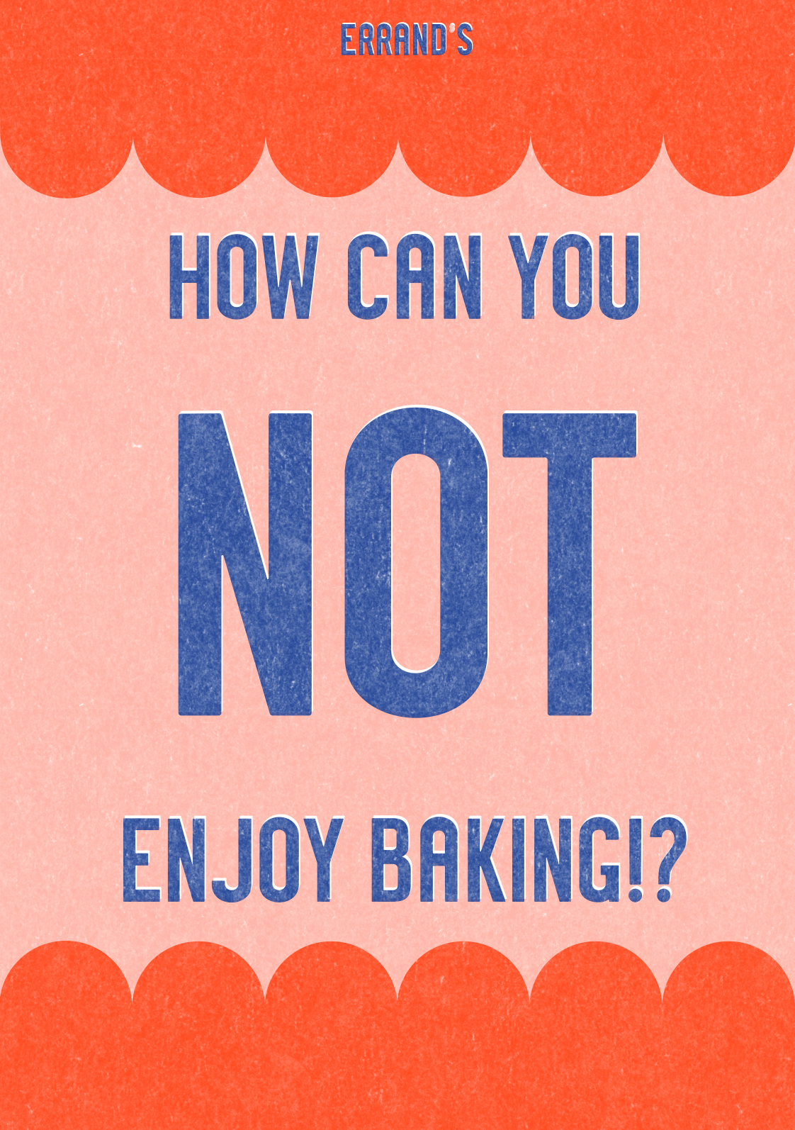
Errand’s
Our project deals with the marketing language of domestication and how gender roles influence the decision making in design and marketing. Being appalled by old German advertisements and educational videos for the Swedish housewife from the 1950s, we set ourselves the challenge to explore the topic further in form of a fictional shop called ‘Errand’s’, that sells products which make a comment on the marketing strategy but also the exploitation of emotional and domestic labour of a woman.
The typeface, which I created for the logotype was chosen to be part of the degree show identity, and is now featured on the poster, as well as the website and communicative channels.
This project is a collaboration with Abigail Allen.


WIP Show Identity
This project explores the conceptualisation of our course as a whole and translates it into an identity, which was used on different platforms (online and physical) for our Work In Progress Show. Since we were back and able to use the studio, we relished the opportunity to use analogue processes again and the work could ‘spill over’ from the studio down to the exhibition space in the foyer of the Reid building. This idea was symbolised through the theme of punch cards, which represents a mechanical process, again representing a bridge between the analogue and on-site work and the digital work. For this, we experimented a lot with analogue ways of printing and working on the poster, starting off with printing a colour with the Riso and then trying to recreate that texture through other methods like screenprinting, so that we could print on coloured paper with an opaque colour. Another idea was to have actual punched out holes in the poster, which would have had to be done with a lasercutter. Unfortunately due to lack of time and resources, like the paper and other papers we initially wanted to use not being available, we had to shift our idea and had to print digitally – which actually helped us to bring all the elements together we had in mind all along, whilst not losing the visual language of the punch card. The identity encompasses not just the posters, but also the whole online presence, animation as well as the design of the exhibition on-site, including captions and a long poster that is supposed to represent the ‘overspilling’ from the studio.
This project is a collaboration with Abigail Allen and Mark Burgoyne.
Project Links


Invisible Forces
For this project, I chose smells and the olfactive system as a topic for me to explore within the brief of ‘Invisible Forces’, as I have inherited a rather sensitive nose from my mother. The brief was quite open, so it allowed me to be quite broad within my research. I was primarily drawn to experiencing smells through generating and visualising them and looking into how smells and memories are connected. I started a few experiments trying to visualise smells on the street and put them on a map or a graph, as well as letting people smell essential oils blindfolded and let them write down their associations and memories.
From this, I started to interview people about a memory they have regarding a certain smell. Using a mix of archive footage and my own generated videos, I created a visual for the interview I did with one of my coursemates, trying to visualise the memory of smell (in that case suncream). Within this, I realised that the final outcome did not just visualise a scent, but all the senses surrounding the memory, as all the senses are interlinked with each other and so are a true invisible force as they influence emotions and memories.


Da haben wir den Salat (A Vegan German Cookbook)
Initially planning on reviewing different cookbooks from different cuisines on their sustainability or ability to cater for different diets, I thought that it would be a much more personal project to make my own excerpt from a German vegan cookbook, featuring my favourite recipes from family, blogs and my own recipes that I ‘veganised’ over the years. I wanted the book to have an overall working concept and feel ‘German’. For this, I wanted to combine the old and rustic German with the new and minimal aesthetics of Dieter Rams. The book is accompanied by a range of photographs and illustrations that I created, one of which now also forms the cover of the book – a gilded sausage with nothing else on the cover apart from some embroidery on the spine. When you open the book the neon red endpapers are revealed and the name of the book – ‘Da haben wir den Salat’ (Now we have the salad), which is an idiom used in the same way as ‘being in a pickle’.


